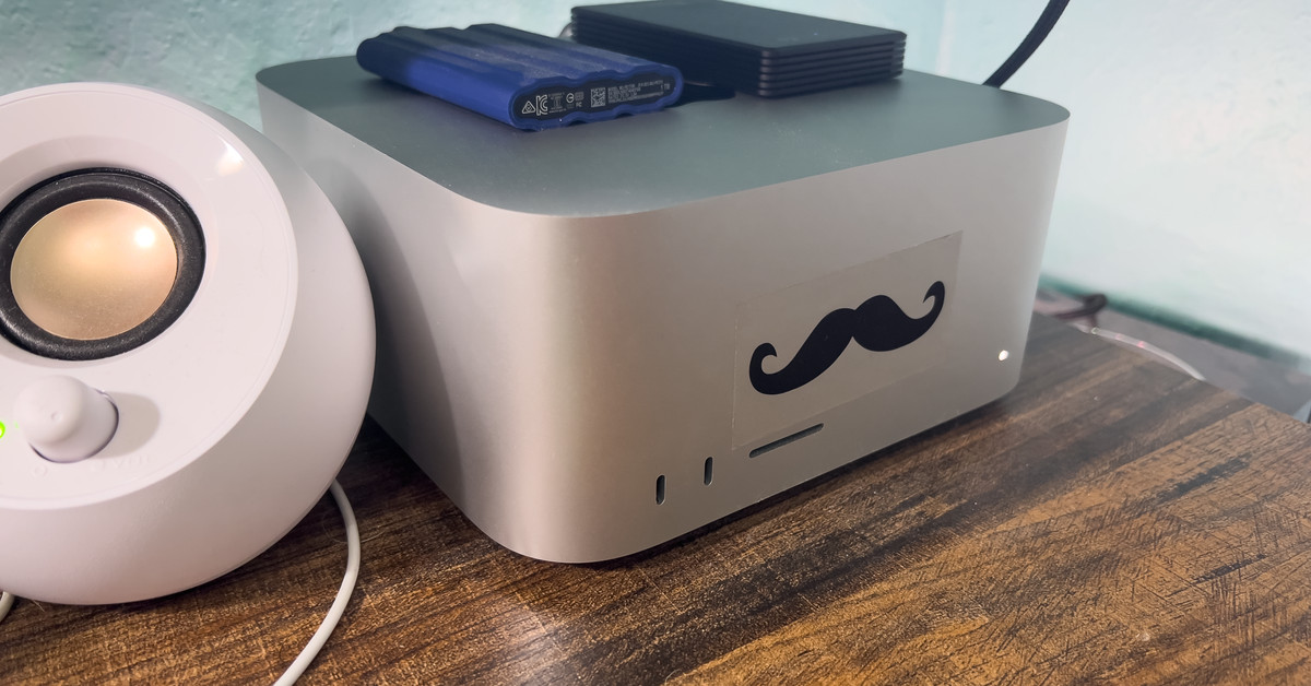
Not to be all Marie Kondo about it, but my Mac Studio sparks joy in me every day, and it’s not because it’s the fastest computer I’ve ever owned. It’s also not strictly about the front-facing ports Apple gave it, nor is it the village of ports that live in the back.

See, I found this mustache sticker in the back of a drawer in my house. I don’t know where it came from, only that it was there, and the moment I found it, I knew immediately where to put it: smack-dab in the middle of my Mac Studio. I’d been thinking for awhile that the Studio has this goofy face on the front, and slapping a curly ‘stache on it just drove that home. It delights me, and recently, I’ve been thinking about why this goofy twee addition to my computer makes me so happy.
When my partner and I sold our old home to relocate to another state a few years ago, we wanted to sell it as is. We’d painted it pink, and on the inside, we’d covered some of the walls with murals — a desert scene I’d painted in the dining room and a geometric pattern my partner had painstakingly covered our bedroom wall with, for instance. When one of our realtor’s colleagues did a walkthrough to give us recommendations, he told us we have to paint everything over with something neutral, like gray or white.
People want to envision themselves in the space, he said, and they aren’t always imaginative enough to see past an already-colorful wall.
He told us a prospective buyer might be otherwise in love with the house, then walk into the bedroom, see the intricate linework on the wall, and say, “Ohhhh no,” and decide not to buy just because of that. People want to envision themselves in the space, he said, and they aren’t always imaginative enough to see past an already-colorful wall. They need a blank canvas.
It’s since occurred to me that this same idea is at play, at least for some people (myself included), in Apple’s product design, and by extension, the design of so many other tech products from companies that hit the same notes.
So many of Apple’s devices — its laptops, desktops, phones, and so forth — are characterized by these expanses of flat nothingness. Their featureless planes are often only broken when they have to be; by a keyboard or a USB-C port, for example. These days the company no longer even prints “MacBook” under the screen. It’s easy to call that boring, but I disagree.
I’d argue that simplicity gives it far more personality than some of the one-note looks sported by, for instance, basically every gaming router, which often overwhelm you with their thing, whatever it may be.
Some people like that sort of thing — and that’s okay! I do too. But as the saying goes, it takes all kinds to make a world, and design, from my lay perspective, isn’t always about what’s there, but sometimes what isn’t. Where one person sees a big, uncreative flat space in the back of a MacBook Air’s display, another person may see a canvas they can fill to truly reflect who they are, using stickers, a Sharpie, or even paint.
Or, you know, a mustache.


